Creating value through design and heuristic evaluation — a case study
How we adapted Nielsen’s methodology to the e-commerce context

We access several websites every day. Even without realising it, we are constantly analysing the sites. Judging them in many aspects like reliability, credibility, and competence. We also make unconscious judgments about its usability when we are unable to make a purchase, for example.
All our analysis and judgments, if used correctly, provide us with excellent tools to create better sites / products.
That’s what heuristic analysis is all about, which has that somewhat scary name, but don’t worry, it’s not rocket science.🚀
Heuristic Evaluation
In the context of UX, heuristic analysis is nothing more than a research and evaluation of the usability of a website, based on the best practices of User Experience. It doesn’t seem difficult right? And in fact it is not.
Want to read this story later? Save it in Journal.
Why should I use it?
Because from it, we find opportunities and new ways to provide a better user experience. There are many types of heuristic analysis, the most famous methodology was presented by Rolf Molich and Jakob Nielsen in 1990 and widely used today.
Goals:
- Identify site strengths and weaknesses
- Find out bugs and issues
- Suggest usability improvements
- Define points of attention and how to act upon them (action plan)
Conduction:
In order to carry out a heuristic analysis, a set of expert reviewers is required to examine whether the website complies with recognised usability principles, also called heuristics. Each evaluator inspects the interface individually and all gathered conclusions are analysed together. It differs from user testing because the responsibility for analysing the interface lies on the evaluators.
In this case study, we are going to talk about a furniture retail e-commerce.
Evaluation checklist
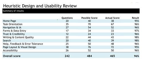
The heuristics are general rules that apply to different interfaces. Along with them, there is an evaluation checklist to guide the professional evaluator. The idea is that they will be browsing the website and grading it according to the Nielsen method. There are several online checklist templates that can be adapted to test the usability of a website / product. Even Nielsen Group encourages the adaptation of the checklist to get the most out of the method.
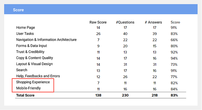
As external consultants, our adaptation of the checklist was focused on our main b2b customers: e-commerces. This resulted in the addition of 2 items to be evaluated: “shopping experience” and “mobile friendly”. These items mainly evaluate the product pages, observing aspects such as: price, photo layout, search filter, etc. On mobile, issues like button size, hit area, and whether the menu is intuitive (information architecture).
Now, we need 3 to 5 multidisciplinary professionals, who could individually analyse the e-commerce based on the dimensions pre-stipulated.
An evaluation by a professional usually finds 20% of the usability problems of a website. For this reason, 3 to 5 professionals are recommended.
Taking advantage of the multidisciplinary collaboration, we assembled a team with professionals from adjacent areas to the design to enrich the evaluation. This adds plurality, and valuable detailed results. In this case study, we used 4 evaluators: 2 UX Designers, 1 Software Engineer, and 1 Quality Assurance expert.
Evaluating the experience
Here, each evaluator browse the site and try to perform possible real-life user tasks. One of the tasks is to try to buy a product and analyse the flow of the website to achieve that. As the items are evaluated, the team members give a score based on principles and best usability practices.
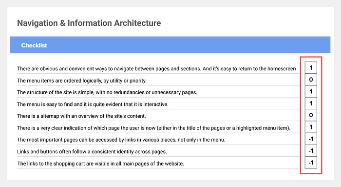
At the end, we have percentages from each evaluator, meaning how much the site meets those usability criteria, divided by categories.

Understanding the results
In order to quickly identify the most problematic areas and facilitate decision making, it is very important to visualize the data in a clear and objective way.
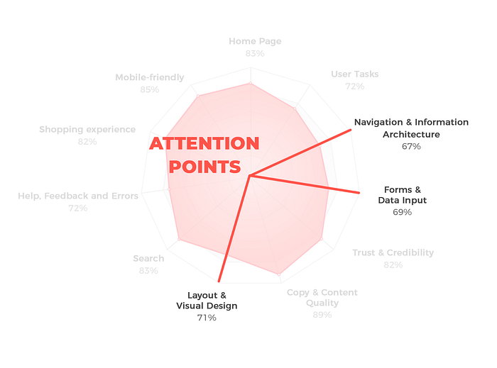
Radar diagrams are perfect for this type of analysis, because they provide a recognisable shape based on the score. The more circular the radar, the more balanced the score; the more star-like appearance, the greater the variation in the score.
With these results, we reached the following radar chart, with the average of the evaluator's scores:

It is possible to observe that the most critical categories of the website were:
1. Navigation and Information Architecture (67%)
2. Forms and Data Input (69%)
3. Layout and Visual Design (71%)
Opportunity Analysis
Although this result is eye-opening, by making it easier to see the weaknesses of the site, it doesn’t make it clear how and what we should exactly act upon to improve these metrics. For this reason, our team combined heuristic analysis with what we call “Opportunity Analysis”, created by UX designer Matheus Rothen and constantly improved by our awesome UX team.
This analysis helps to visualize problems and its priorities. The idea is that while the professionals fill up the usability checklist, they report Quality Assurance (QA) issues and bugs that were found during the analysis (using a spreadsheet).

Prioritizing and organizing data
So far so good, but if we don’t know how to organize this huge amount of information and prioritize data, our effort can be useless. At the end of our QA analysis, which is completed together by all the evaluators, we can better see which page has the most issues:

Going further, the results can be easily visualised by a prioritization matrix. In our case, 62 opportunities for improvement were found, categorised by complexity and priority in the QA spreadsheet.
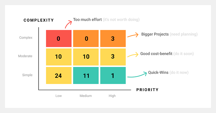
From now on we have the problems mapped and we know where to start and what are the most serious problems. If the two methodologies are aligned, the results will complement each other. For example: On the radar chart, the item “Forms and Data Input” got the second worst score. In the QA spreadsheet, problems were found while filling out credit card details and while trying to login. The triangulation of these two results gave us more confidence, and guided us to take action.
Transforming data analysis in delivered value
After gathering all this data, it’s time to get our hands dirty and propose suggestions of improvements. It can be through reports, benchmarks, wireframes or even final layouts, attacking the problems with the highest priority and low complexity first. In this case study I will briefly show how we solved some of the problems using wireframes as exploration tool.
Filling credit card details:
This is a key moment in any e-commerce not only because it is a decisive final step of the purchase, but also because users can be feeling worried about security, and often under time pressure. Therefore, doubling down care at this stage is crucial.
According to a study published by the Nielsen Group, a form that follows basic usability guidelines is almost 2x more likely to be completed than one that doesn’t.
To decrease users cognitive load, we suggested the following improvements:

Suggestions (new version):
- Sort the fields according to the physical credit card, reducing the search time for the data. This way, the user doesn’t need to scan the reading in Z format, which increases the filling speed.
2. Expiry month and year with only 2 digits to fill.
Login fields:

Suggestions (new version):
- Social login should be more prominent, as it facilitates identification and eliminates the need to remember another password.
- Clear path for users who are not registered, without the need of going to another tab.
- The size of the field according to the expected response. If a field is too long or too short, users can question themselves if they understand correctly what needs to be answered.
- Option to see the password. This way, users can correct it if necessary.
Learnings
We shouldn’t underestimate the impact of changes often perceived as “minimal or subtle” and end up at the bottom of our backlogs. While dealing with key moments of experiences, such as e-commerce checkouts, every detail counts and can have a huge impact on conversion.
What I like the most about heuristic analysis is that it’s a powerful tool to bring clarity and shared understanding on which problems to attack first. Then, once we’re able to surgically tackle them, businesses end up seeing positive impact in their conversion rates and hence in their revenue. 🤑
